This is the best KODI remote control I’ve ever used.
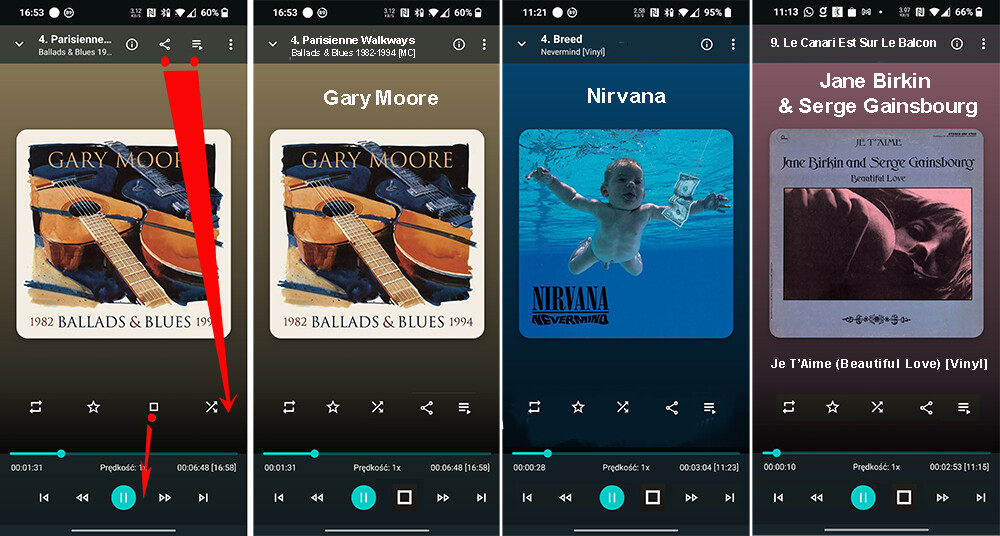
However, it has a few hardly legible positions (vertical).
Maybe it can be improved? My proposal in the pictures.
Thank you for an excellent job.
There’s a thread about this ![]() Now playing screen rework
Now playing screen rework
But stop is nearly not used, would be ugly there and you can always long press the play button to stop.
Share is 0 used so well.
For the playlist you can just swipe up in the screen to see it.
For the rest yes there changes to be made but you need to take in account all cases including landscape / tablets and non audio content.
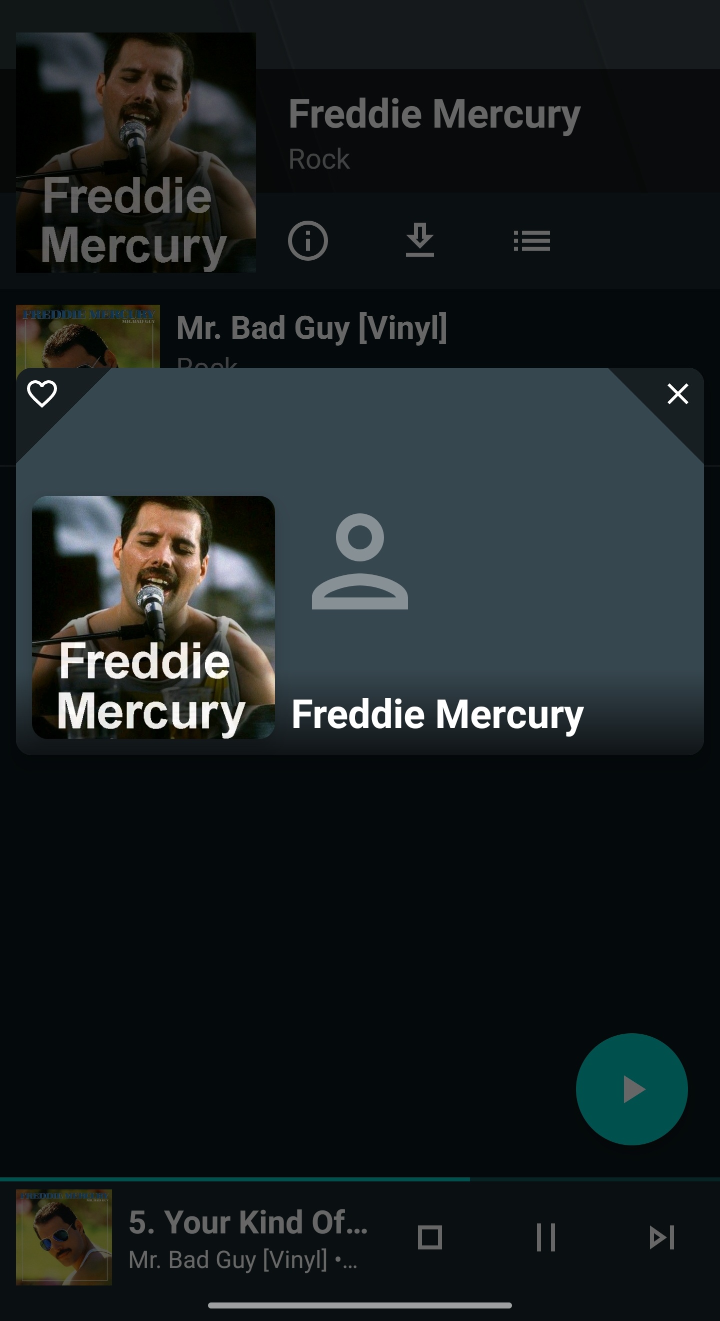
The fanart, bio, genres, years, all info available for scraped artists.
Fanart are displayed if correctly send by Kodi ![]()
https://yatse.tv/wiki/debug-yatse-kodi-remote for proper issue with logs during sync.
What the GUI and some addons can do and what Kodi API do and return are 2 very different world.