So time have come to reopen discussions about the now playing screen.
This is a touchy subject as everyone always have very strong opinions that each represent the only truth
Since Yatse can control many different things and run on many different devices with strange form factors (phone, tablets, …) this require a lot of different cases with many data being potentially missing.
But as this needs to be maintained cases needs to be limited and have the most common things possibles.
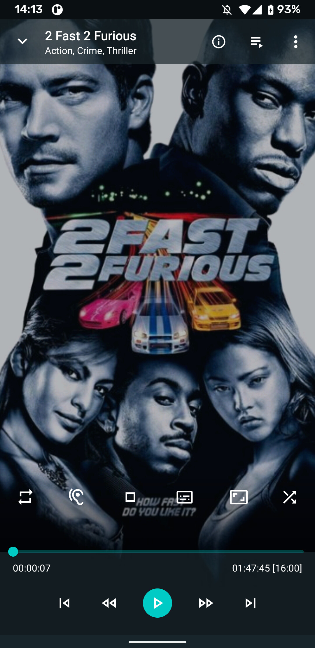
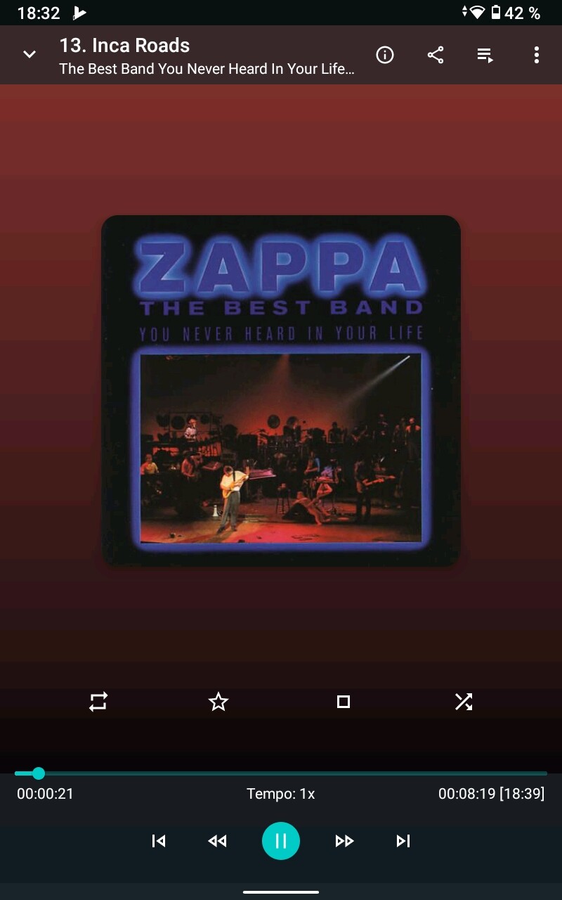
Here’s the current screens for a phone. Please explain what you like / don’t like and what you’d like (Even better with quick paint designs)
I like the Now Playing Screen as is and never thought that things should be fundamentally different. There is only two things I sometimes stumble upon:
The stop button seems out of place, so far away from the rest of the playback controls. But I think I understand why it is where it is, and once you know where to look at it is not really a problem.
The progess bar is not easy to handle on a smartphone if you want to navigate to a specific point especailly on hour-long TV episodes. Something like the bar zooming in when you hold it on a certain point for more than 2 seconds or so would be handy to navigate more precisely. But that sounds like a lot of work, might confuse first-time users and might be rarely needed, so it is really only nice-to-have.
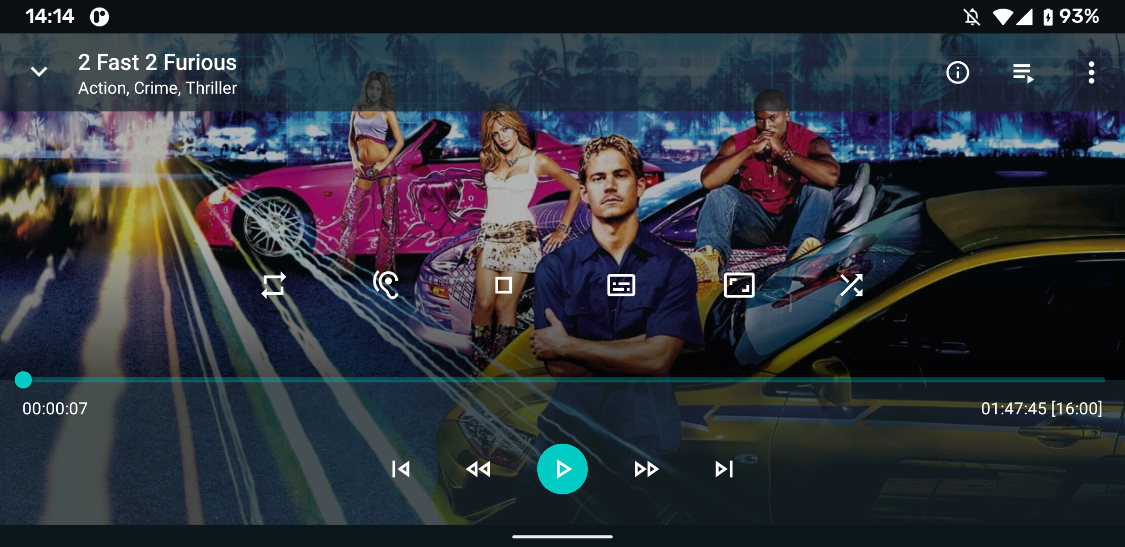
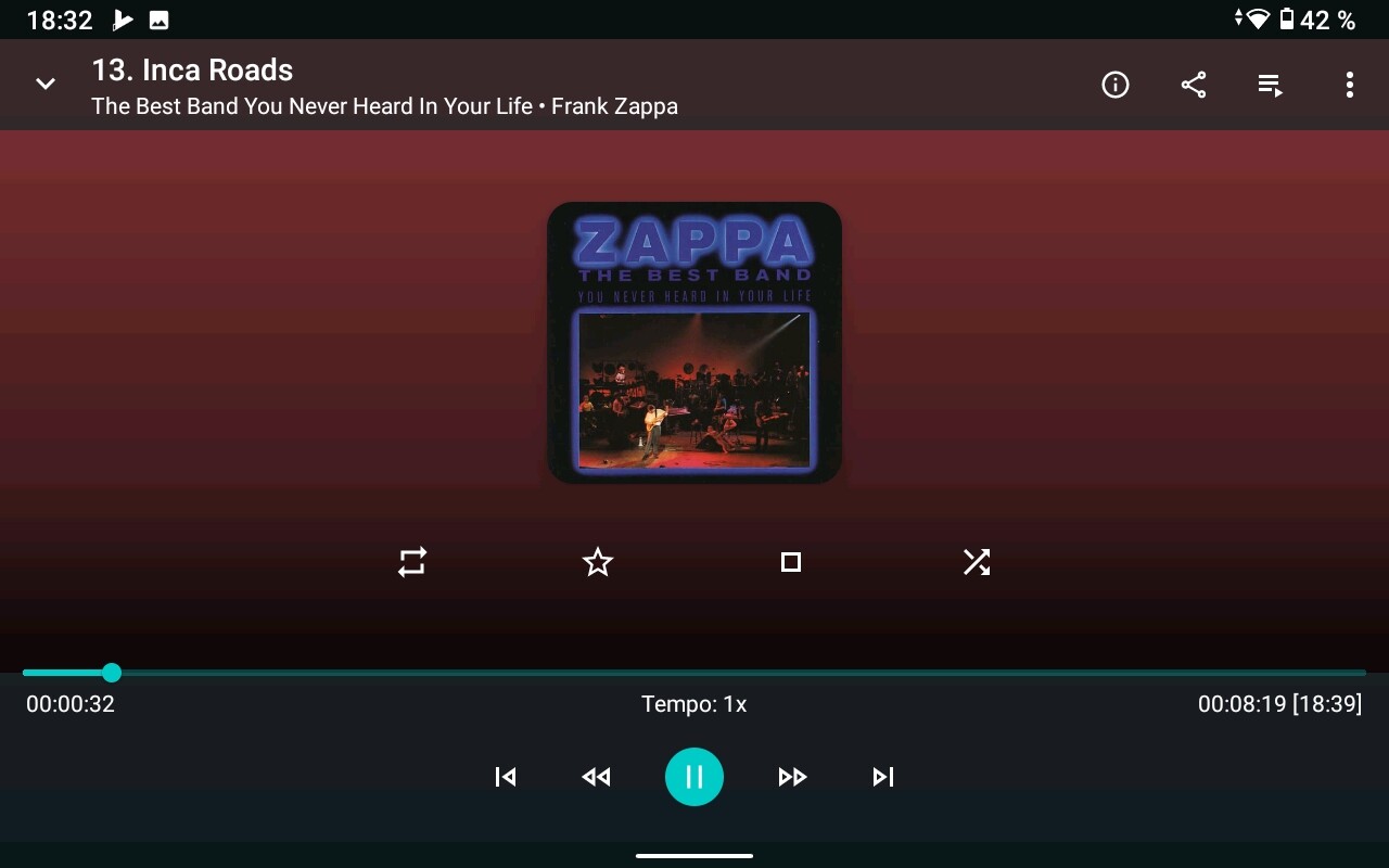
For the bar I’m not sure to follow, you can long press the bar and have a dialog, or press the times and have a dialog.
When you scroll in the bar without removing your finder there’s a popup that shows the time you are at for precise seeking too.
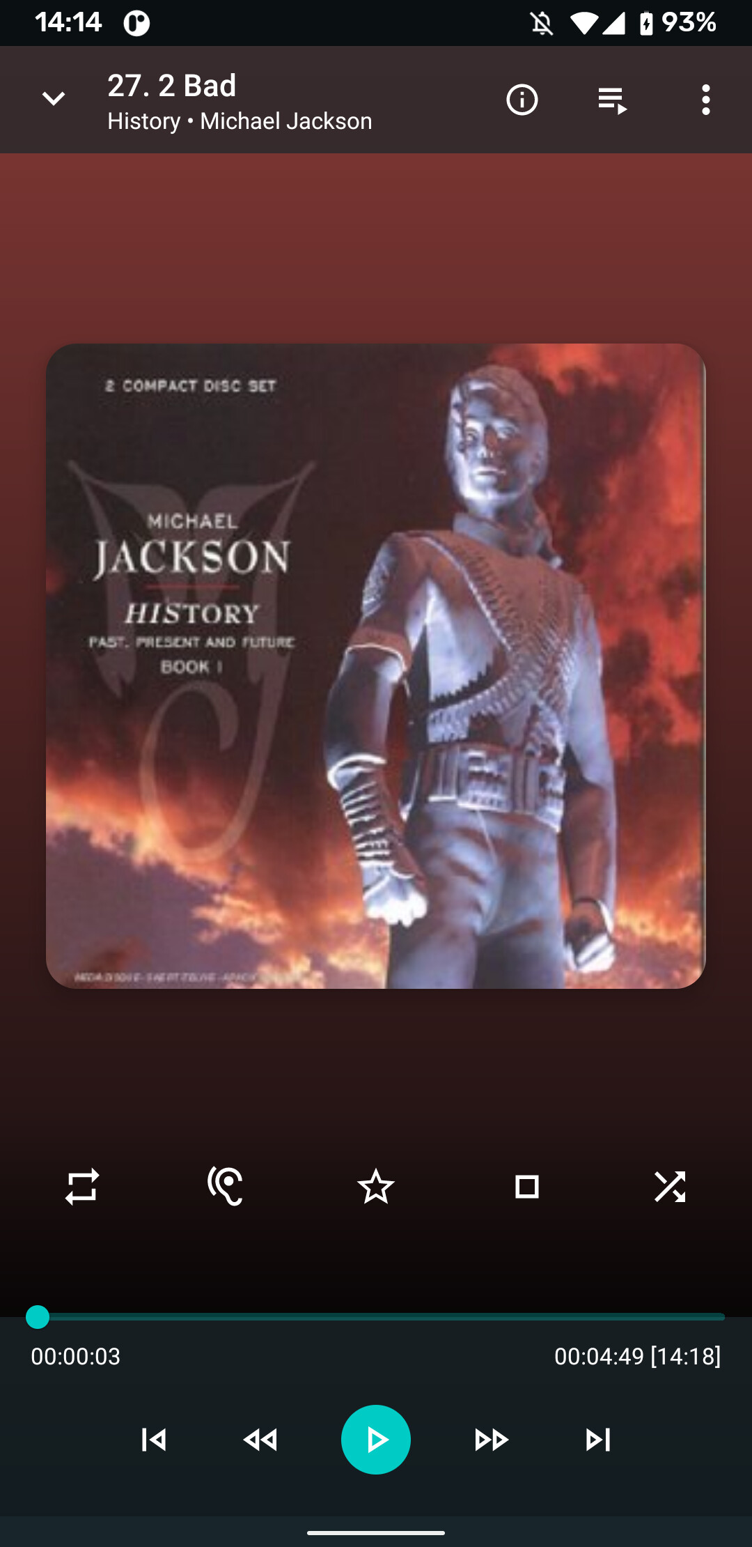
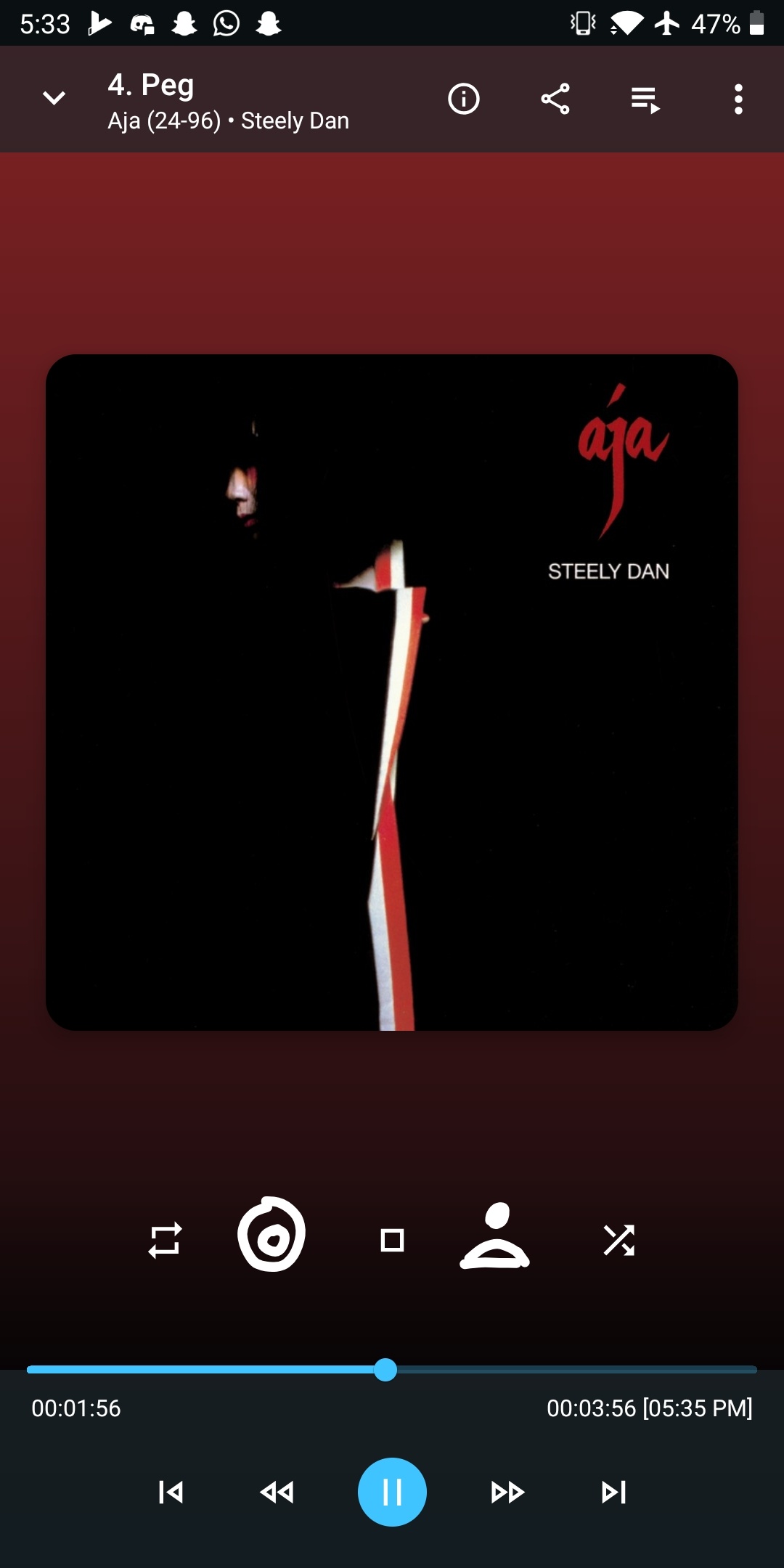
I’m quite happy with the app and the screen. Just few things I’d like to improve in music playback:
There’s enough empty space to show bigger album art on my 16:10 tablet screen.
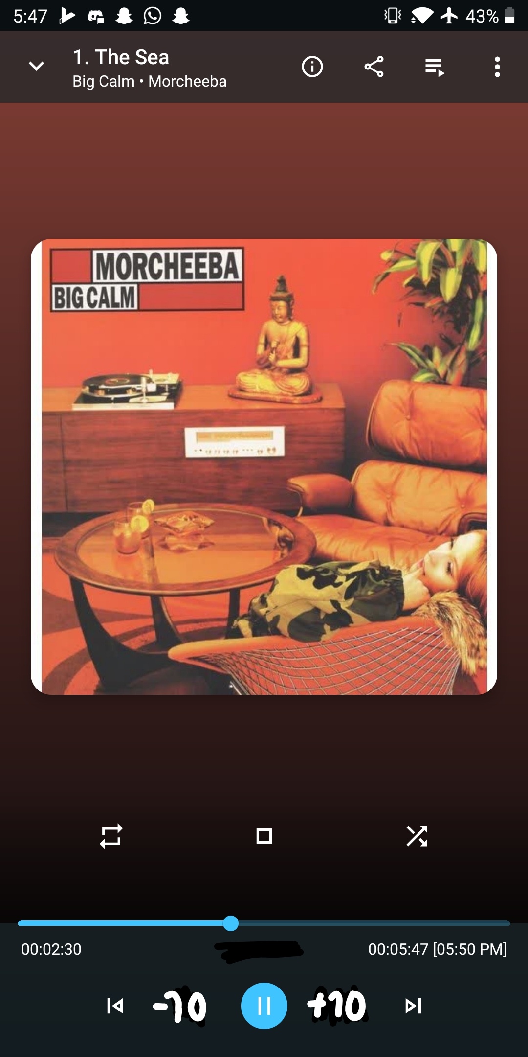
In landscape view, album art is really small. Why not place big album cover on one side of the screen and all controls on the other half?
It would be great to have the possibility to custom select, which buttons will appear underneath the album art. In my case, I would omit repeat and rating, but like to have “go to Album” and “go to artist” instead.
I really like how the backgound colour automatically matches the image. But there could be less beckground, especially in landscape view. My screen resolution is 1280 x 800
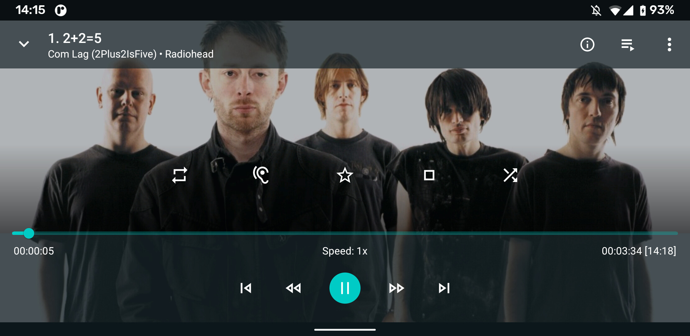
I would vote for customizable buttons, too. I thought of including that in my wishlist, but I did not want to make too many demands Something like “go to Album” and “go to artist” would of course come handy (I know that this is available in the three-dots-menu and I also read about the problems with the last-screen-history).
Here’s my recommendation, my life would be complete if the white buttons would be customizable, and be able to add a “go to album” and “go to artist” shortcut.
Oh and perhaps the speed buttons could become skip forward and backward buttons when playing music. But they’re not in the way so if people use those for music, let them be