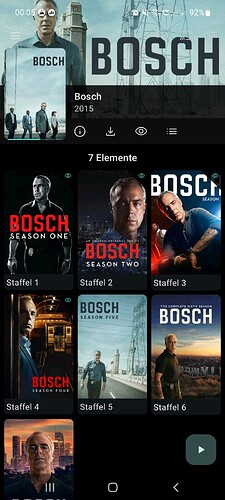
I am not sure but I think this came with the v11 redesign - is it intended that the background of the top bar (where clock, notification icons, battery etc are) is used for the poster artwork? Depending on the artwork, everything there might be difficult to read (this includes the cast, search and sort buttons btw).
I think most apps usually leave the top bar alone. Looks nice, on the other hand, and look at Bosch’s cool sunglasses in above screenshot ![]()
