Hello, this is more a design idea rather than a feature request, I hope I make myself clear:
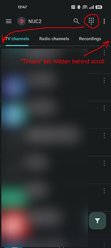
Right now the PVR has 4 tabs:
TV channels
Radio channels
Recordings
Timers
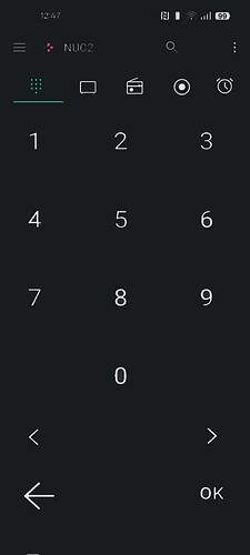
If one wants to use the “classic” remote control then you have to click on the numpad icon and a new floating window pops up with the numeric pad plus four additional buttons (<, >, <-, OK).
My suggestion is as follows: instead of having this popup window (which in my opinion is a little bit too small), adding a 5th “Remote” tab with these buttons (in order to avoid having to scroll to locate the tab I would also remove the “channels” text from the “TV” and “Radio” tabs) and put it in the 1st position. This way the user would not have to click a button if they are more comfortable with the numeric control and there would be more space for bigger buttons.
I hope this makes sense and that it’s easy to implement.

