One of the best apps for me that i paid for. The way it downloads contents from my Plex server like plex cant do is just the best thing. I have a few suggestions for dev though
Make a separate tab on homescreen for downloads to make accessing offline media more convenient.
Make the overview tab a little bit more handy by adding more options like Recently added Tv shows etc and also its interface needs a little more hauling to use max screen space
There’s no need for a download tab, just enable the offline only filter, or even the automatic offline mode.
For the rest as said on Play Store, it’s already there and like does not describe a precise need, so take time to tell exactly what you think is missing
I get it offline mode is there but wouldn’t it be better if we have a separate tab for offline media? Just like netflix? Its just a suggestion which i think would make this experience even better for me.
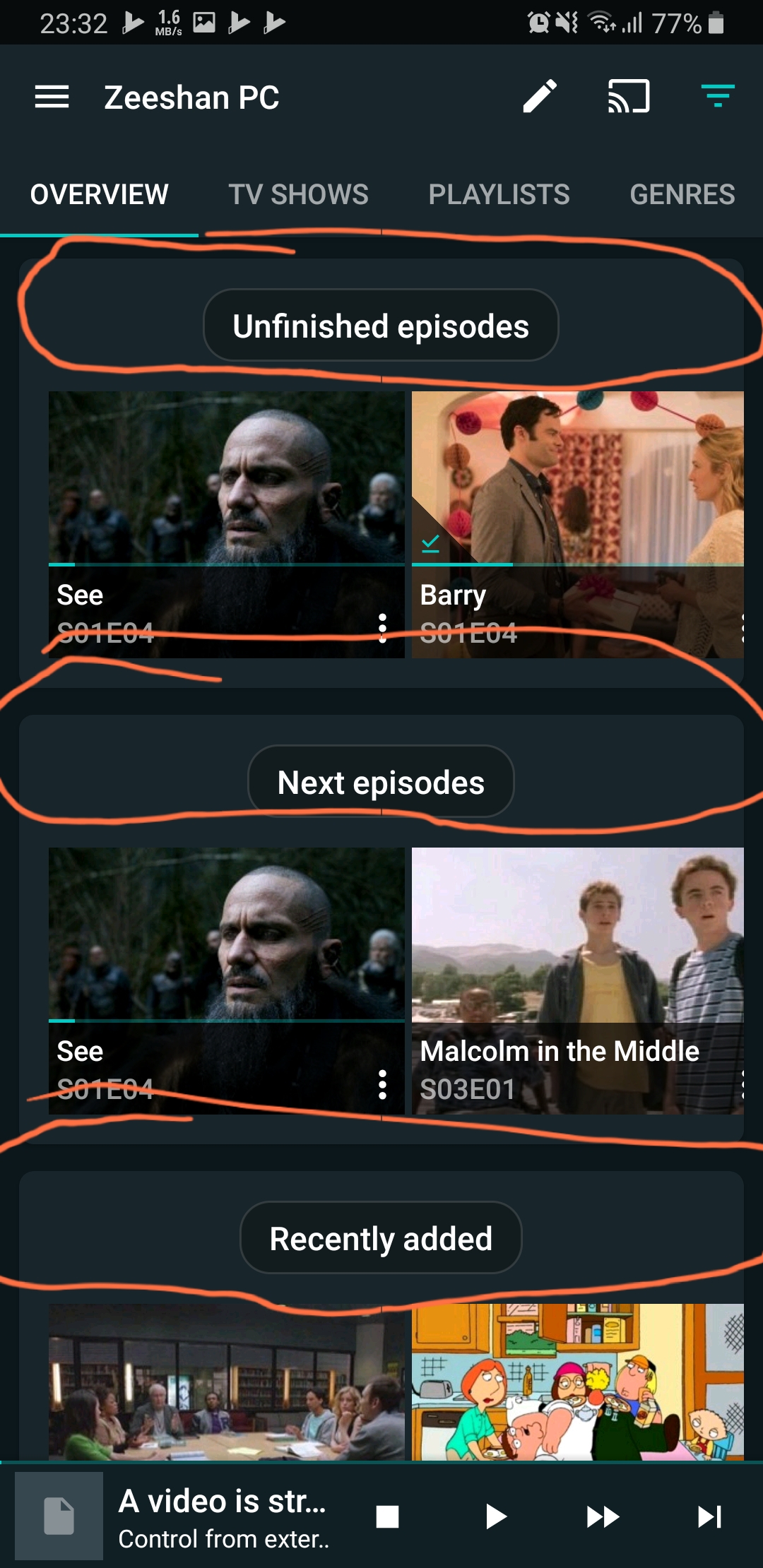
Secondly im talking about the overview tab it uses very less screen space because most of the space is occupied by big headers …i hope you’re getting me?
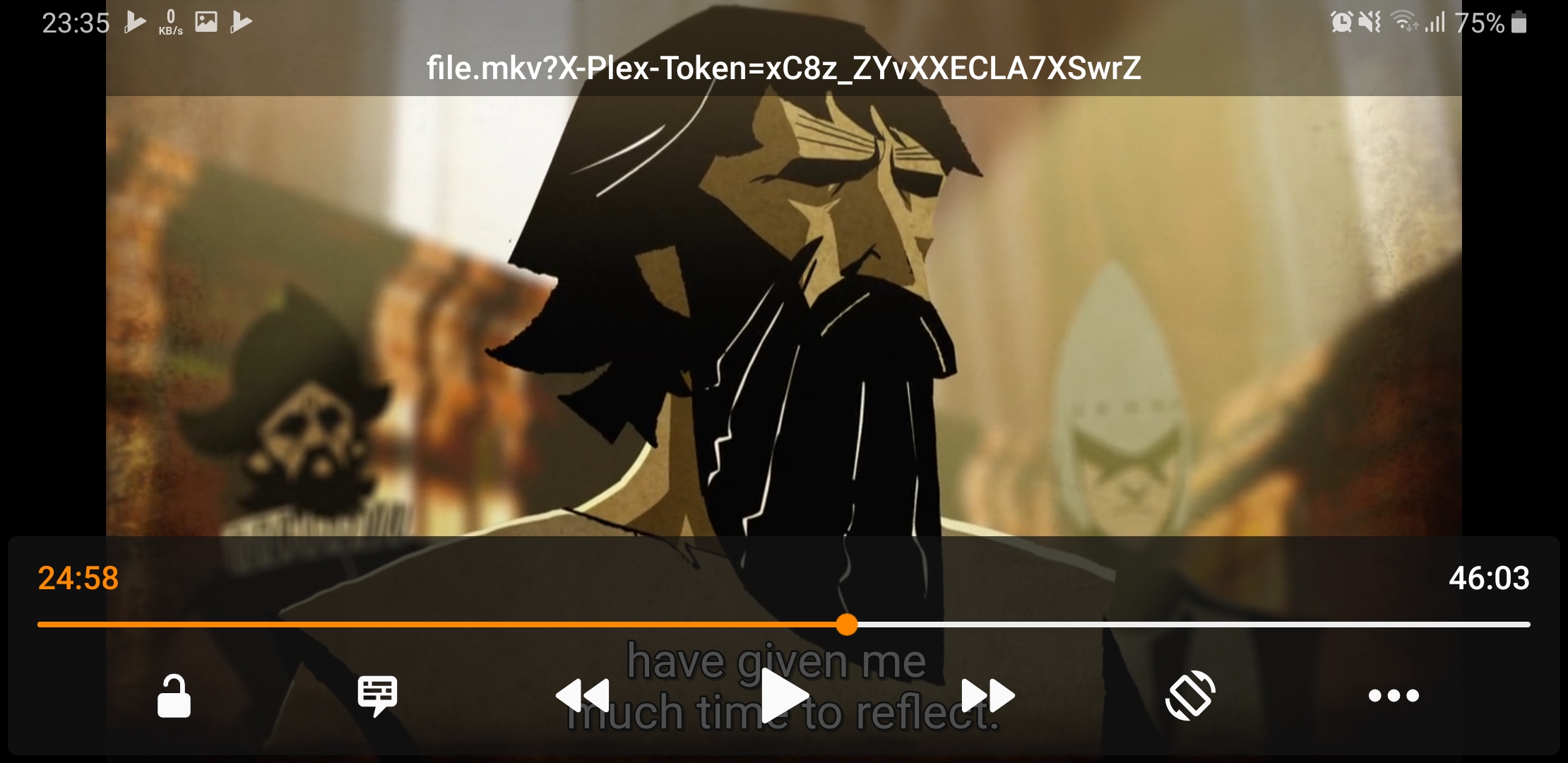
One more thing…is it possible to show the actual movie/ tv show name when watching from a third party video player? Because right now it just shows something random
What would be better? Different sections for the same content makes no sense. You want a movie you go in movie why should there be a second movie part that would show the exact same content in the exact same way.
And no I don’t see since you post no screenshots And you are not talking about missing things.
I was talking about this screen …so much space left un utilized…and why not just show thumbnails of the show/movie poster rather than these wide random thumbnails?just a suggestion
For the title since you use VLC you need to select VLC as the player in the settings.
For the downloads, no I’m sorry there’s no reason to be like Netflix. Filters and automatic filters are way more natural, unlike Netflix Yatse also handles music, do you imagine 600 synchronized songs shown like that, or a tons of episodes and movies? You would gain absolutely nothing. Offline filter is way more efficient as it works across everything including the overview tabs you already have your next episodes in proper order and filters and everything useful to manage things.
Clicking on that tab or clicking on the show tabs takes the exact same amount of clicks, and would display the exact same thing. There’s nothing to gain from that.
For the overview screen it respect Material design specs, I could cheat a few pixels but this would not change a lot of things, and for the episode / shows images fanarts and real thumbs are better looking to discover shows, and seeing 10 times the same show poster when you add 10 episodes of one would look ugly.
So the only thing left is the “missing” sections of the overview screens, but since it does not correspond to the title please open a new feature request with details about those.
The offline filter takes a little manipulation because it does not activate in Android Auto mode and I still have a WiFi signal in my car. Therefore to get the filter to work I have to do the following: Close Yatse, disconnect WiFi, open Yatse again, allow Yatse time to activate offline mode, and then start my car. If a dowloaded tab does not make sense then alternatively could there be an option to activate the offline filter when Android Auto starts?